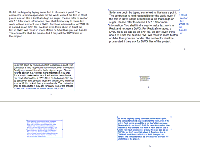
This is one of the most annoying behaviors in Revit. I can’t believe that we’ll have to deal with it for at least another year. Pretty sad.
We need text, don’t we? Unfortunately creating project notes in Revit is a frustrating endeavor. Text re-formats itself depending on the zoom factor, which is totally insane if you ask me. Take a look at this animated gif.
So how do we deal with this issue? You could link in a dwg that contains your text, but this can potentially result in more headaches as mtext boxes are sometimes ignored by Revit. And honestly, I want to stop using DWG files altogether. Another huge limitation is the inability to indent text so you can number each paragraph and be able to adjust the column width of your text without resulting in a formatting do-over.
Back at AU2007, I learned a tip which I’ll be employing from now on. I feel really dirty using it, but there’s no other solution I can think of. I’m not sure where it originated but I learned about it through a hallway chat with the “Rock-n-Roll Architect”, aka Steven Shell. If you know who contributed it, please post a comment. Here it goes…
Create a Key Schedule for a category that you never use. No, the Roads category is not available ;) In this example I chose the Sprinklers category but you’re free to pick anything you want.
Notice the Name field. That’s the name of your key schedule in the project browser, and will also be your Title when you drag this onto a sheet. It’s not necessary to change it in this dialog since you can rename it later in the Project Browser. I named my example “GENERAL NOTES”. Next, type in a Key name and click OK, which leads us to the Fields tab.
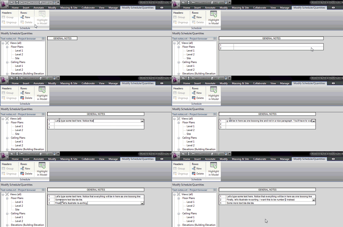
Add a new parameter to house your text notes; I used “MyText”. In the Sorting/Grouping tab, sorting will be set by default to the Key Name, which is exactly what we want. This will contain the numbering of each paragraph. To finish up, set your appearance preferences. In my case, I wanted a wide outline and turned off the option to Show Headers as we don’t really need them. Once you click OK, you’ll be in schedule editing mode which will just show the title (If you choose to not have a title, you’ll get a blank page). The next step is to add rows to your key schedule. Let’s use Revit’s new interface to illustrate (click animated gif for larger view).
Now you just drag this onto a sheet and make final adjustments there. This should eliminate the problem of Jumpy Text. A couple of issues that you’ll face are the fact that you don’t have Project Browser sorting/grouping capabilities and that you cannot use the same schedule name twice, so you’ll have to get creative. One option is to have these key schedules named with a prefix so they’ll be grouped together in the Project Browser and separate from “real” key schedules (ex: txt_Roof General Notes). Then you would turn off the Title and just type in text directly on your sheet as seen below.
PS: Autodesk, PLEASE, this needs fixed. Seriously.


12 comments:
Hi Dave! I've something related to this. I've made a tutorial (of course it's in italian) on the creation of tables in Revit using the annotation block.
Here is the link on www.3dsmile.it:
http://www.3dsmile.it/distribution/viewtopic.php?f=78&t=13465
I hope this can help someone else and push Autodesk to introduce a more powerful text generator in Revit, with other useful features such as the possibility to justify text, doing lists etc...
Salve Paolo! Grazie per la link; bel' tutorial :)
We typically use note blocks for addition/renovation work, especially for demolition plans. Several types of the same symbol are created and each gets a number/letter and text to describe the action. So for example "A" will have the text "Salvage existing light fixture and place in owner's inventory for future use". When "A" is placed in a view, it is also scheduled in the Note Block. If A changes to B, it updates both in plan and in the Schedule, thus improving coordination and reducing errors.
I agree wholeheartedly that we need major improvements in text tools. We'll keep waiting :)
Buona settimana!
Thank you Dave! The same to you!
PS
I've noticed that when you tick "show all the categories" in the schedules window,there are two of "illumination devices" but the second it is not related to the components present in the model, so I can use it for the purposes you've explained in this post.
I think this is probably due to an error in the translation from english to italian. Is this true also for the english version? If it does we can use even sprinklers!!! :)
Thank you for your inspirational works!
Haha lost in translation?!
In the English version, there are the two categories Lighting Devices (such as wall switches) and Lighting Fixtures (such as pendant lighting, recessed downlights, etc). Really, each discipline can use the other discipline's categories. So Architects could use an M/E/P category, Structural can use an Arch. category and MEP can use a Struct. category. As long as you don't model that in your project file, you should be safe.
Grazie per i tuoi complimenti. Faccio 'l mio meglio!
Thanks for the post on this issue- its definitely one of the main problems with documentation in Revit right now. We use the "Nurse Call Devices" for our Schedules.
This is ok for 1, 2, 3. What about if you have a sub category a, b, c
In that case I think you're simply out of luck :(
Hi Dave--
Revit has fixed the "Jumpy Text" issue, correct? I believe I'm unable to reproduce the issue anymore!
Trey
Unfortunately it's still not fixed :( The behavior has not changed.
Just had to laugh for a minute. I first found this hack/hint in 2009 and here it is still the only way to accomplish this seemingly easy task. Works great though.
Yep, still an issue and I'm betting there's no end in sight. Quite sad really. Several words come to mind...appalling, preposterous, disgusting, disappointing, ridiculous, unacceptable, absurd...I'll stop here :)
Thank you Dave, you have confirmed my fear that Revit has not implemented proper text formatting methods.
Post a Comment